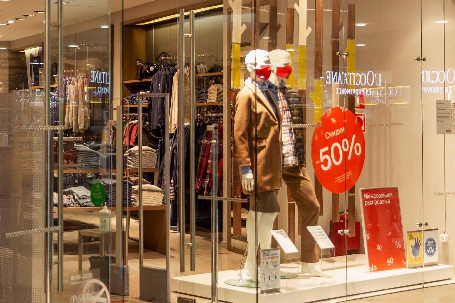
Visual merchandising is an art and science that blends creativity with strategy to maximise the appeal of products in a retail space. Effective visual merchandising not only enhances customer experience but also drives sales by capturing attention, sparking interest, and encouraging purchases. To achieve this, several essential elements must come together harmoniously. Here’s a detailed exploration of the key components that underpin successful visual merchandising.
1. Store Layout
The layout of a store is the foundation of effective visual merchandising. A well-designed layout ensures smooth traffic flow and creates an intuitive shopping experience. Common layouts include:
• Grid Layout: Ideal for supermarkets and large stores, this layout maximises product visibility and shelf space.
• Free-Flow Layout: Common in boutiques, this design encourages exploration and creates an open, relaxed atmosphere.
• Loop or Racetrack Layout: Directs customers through a set path to expose them to a wide variety of merchandise.
The layout should align with the brand’s identity and cater to customer behaviour.
2. Window Displays
Window displays serve as the first impression of a store. A captivating window display can entice passers-by to enter the shop. Key aspects to consider include:
• Themes and Seasons: Align displays with holidays, trends, or promotions.
• Focal Points: Highlight specific products using props, mannequins, or lighting.
• Storytelling: Create a narrative that resonates with the target audience.
Creativity and regular updates are essential to keep window displays fresh and appealing.
3. Colour
Colour is a powerful tool in visual merchandising. It can evoke emotions, create contrast, and guide attention. The strategic use of colour includes:
• Colour Psychology: Warm colours like red and orange can stimulate impulse purchases, while cool tones like blue create a calming atmosphere.
• Contrast: Use contrasting colours to make displays pop.
• Brand Consistency: Ensure colours align with the brand's identity.
A well-thought-out colour scheme can significantly impact a customer’s perception of the space and its products.
4. Lighting
Lighting sets the mood and highlights specific areas or products. Effective lighting strategies include:
• Ambient Lighting: Provides general illumination and sets the store’s atmosphere.
• Accent Lighting: Draws attention to featured products, signage, or displays.
• Task Lighting: Focuses on functional areas, such as fitting rooms or checkout counters.
Combining different types of lighting enhances the overall aesthetic and ensures functionality.
5. Product Placement
The strategic arrangement of products can influence buying decisions. Key principles include:
• Rule of Three: Group products in sets of three for visual balance and appeal.
• Eye Level is Buy Level: Position high-margin items at eye level to maximise visibility.
• Cross-Merchandising: Display related items together to encourage complementary purchases.
Regularly rotating products ensures the store remains dynamic and avoids a stale appearance.
6. Signage
Signage communicates essential information and reinforces branding. It should be clear, concise, and visually appealing. Types of signage include:
• Directional Signs: Help customers navigate the store.
• Promotional Signs: Highlight discounts, sales, or special offers.
• Informational Signs: Provide product details, such as size or usage instructions.
Consistency in font, colour, and style ensures a cohesive look.
7. Props and Decor
Props and decor add personality to displays and enhance storytelling. They help create a thematic connection between the product and its intended use. For example:
• Seasonal Props: Use snowflakes for winter or flowers for spring.
• Lifestyle Accessories: Incorporate items that reflect the target customer’s lifestyle.
However, props should complement the product and not overshadow it.
8. Technology Integration
Modern visual merchandising often incorporates technology to create interactive and engaging experiences. Examples include:
• Digital Displays: Showcase videos, animations, or changing images.
• Interactive Screens: Allow customers to explore product details or customise items.
• Augmented Reality (AR): Enable customers to visualise products in their environment.
Technology can make the shopping experience more immersive and memorable.
9. Store Ambience
Beyond visual elements, the overall ambience contributes to customer satisfaction. Elements like music, scent, and temperature work in tandem with visual merchandising to create a multi-sensory experience.
• Music: Choose playlists that reflect the brand and appeal to the target audience.
• Scent Marketing: Use subtle fragrances to evoke emotions or enhance the theme.
• Comfort: Ensure the store temperature is pleasant and fitting rooms are inviting.
A welcoming environment encourages customers to linger, increasing the likelihood of purchases.
10. Consistency with Brand Identity
All elements of visual merchandising must align with the brand’s image and values. Whether a store conveys luxury, minimalism, or playfulness, the visual presentation should reinforce the brand’s identity and resonate with its target audience.
Conclusion
Visual merchandising is a critical aspect of retail success, combining aesthetics with strategy to influence customer behaviour. By mastering the essential elements — from layout and lighting to technology and ambience — retailers can create compelling shopping experiences that not only attract customers but also foster brand loyalty. Whether a high-street boutique or a sprawling department store, the principles of visual merchandising are universal, serving as the bridge between product and customer.


Comments