The garment industry is a complex and ever-changing field that requires careful monitoring and analysis to ensure the highest quality of the product. Quality control tools such as control charts, Pareto charts, cause and effect diagrams, check sheets, histograms, scatter plots, process mapping, and failure mode and effects analysis (FMEA) are essential for identifying potential areas for improvement and making informed decisions about process improvement. By using these tools, garment manufacturers can ensure that their products meet the highest quality standards and remain competitive in the market.
Control Charts
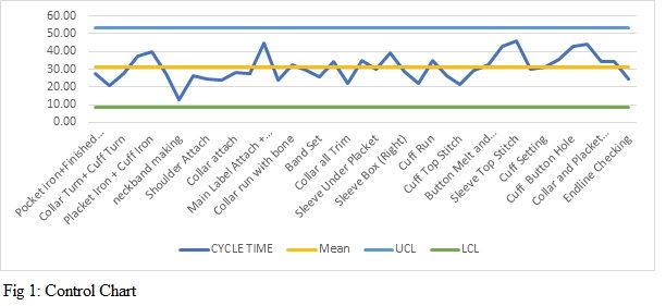
Control charts are used to track the performance of processes over time and detect any changes or trends that may indicate that the process is out of control. These charts are made up of two components: the control limit and the process performance. The control limit is used to measure the performance of the process against established standards. The process performance is then plotted on the chart to identify any changes or trends that may indicate that the process is not performing as expected. In addition to tracking the performance of the process, control charts can also be used to identify potential areas for improvement. By analysing the data on the control chart, it is possible to identify areas where processes can be improved or adjusted to improve process performance.
For example, if a garment production process is being monitored using a control chart, it is possible to identify if there are any changes in the performance of the process over time. For example, if the control limit shows that the average time to produce a garment is increasing, it could be an indication that the process is not performing as efficiently as it should be. In this case, the team would need to analyse the data to identify the root cause of the issue and then develop strategies to address it. (Fig 1)
Pareto Charts
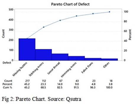
Pareto charts are a tool used in Six Sigma quality control to identify the most significant sources of quality defects. It is a form of data visualisation that helps to identify the areas where improvements can be made. The Pareto chart is a bar graph that sorts the data according to frequency, with the highest frequency items at the top. This allows the user to quickly identify the most common causes of quality defects and prioritise improvement efforts accordingly.
In a Pareto chart, the x-axis represents the different causes of quality defects, while the y-axis represents the number of defects associated with each cause. By stacking the bars according to frequency, the user can quickly identify the most significant sources of quality defects.
For example, in a garment factory, a Pareto chart could be used to identify the most common causes of quality defects. The chart might show that the most frequent defects are related to incorrect sizing, poor stitching, and poor fabric quality. This information can then be used to prioritise improvement efforts and focus on eliminating the most common sources of defects.
Cause and Effect Diagrams
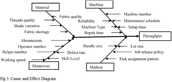
Cause and effect diagrams (also known as Fishbone diagrams) are used to identify the root causes of a problem. They are used to visualise the relationship between a problem and its potential causes. The diagram consists of the problem statement written at the head of the diagram and the potential causes written as branches coming off the main stem. The diagram is then organised into categories such as people, machines, materials, methods, and environment. This visual representation allows a garment factory owner to identify the most likely root causes and then develop solutions to address them.
In the garment industry, a cause-and-effect diagram could be used to identify the root cause of a problem with a garment’s fit. For example, the problem statement could be “Garment does not fit properly”. Potential causes could then be categorised into people (e.g., the designer, the patternmaker, the production team), machines (e.g., the sewing machines, the cutting machines), materials (e.g., the fabric, the thread, the buttons), methods (e.g., the design process, the sewing process), and environment (e.g., the temperature, the humidity). By organising and categorising the potential causes, the most likely root cause can be identified and then solutions can be developed to address the same.
Check Sheets
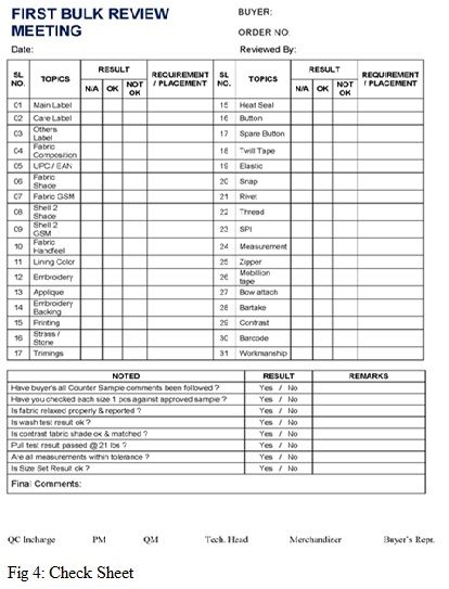
Check sheets are used to document and monitor data related to a process. They are typically used to capture data related to quality, such as defects, rejections, and costs. A check sheet is a simple but effective tool that makes it easy to quickly identify trends and patterns in the data. This data can then be used to identify areas of improvement and make changes that will improve the quality of the process.
In the garment industry, a check sheet can be used to document and monitor the quality of garments being produced. It can track data such as the number of defects per garment, cost per garment, number of rejects per garment etc. This data can then be used to identify areas of improvement in the production process and make changes to reduce the number of defects and increase the quality of the garments.
Histograms
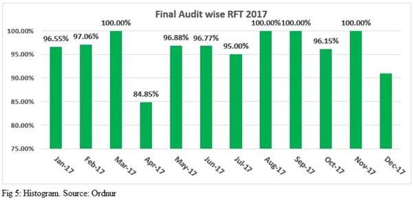
Histograms are used to analyse the distribution of data and identify any unusual patterns. A histogram is a graphical representation of a dataset, in which data points are grouped into bins and plotted on a graph. By examining the shape of the histogram, it is possible to detect any unusual patterns in the data which may indicate something is wrong with the process. For example, a skewed histogram may indicate that the data is not normally distributed, which could be a sign of a problem with the process.
In the garment industry, a company may use a histogram to analyse the distribution of sizes of their products. By looking at the shape of the histogram, the company can determine if the sizes are being produced evenly, or if there is an imbalance in the distribution. This data can then be used to identify any problems with the production process, such as an issue with the cutting machines or the quality of the fabric.
Scatter Plots
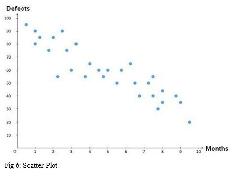
Scatter plots are used to analyse the relationship between two variables. They are used to visualise the data and determine if there is a correlation between the two variables, or if they are unrelated. A scatter plot consists of a set of points on a graph, where each point represents the x and y values of a given data set. The points can then be used to draw a line of best fit, which can be used to determine the relationship between the variables.
In a garment industry, a scatter plot might be used to analyse the relationship between the number of defects in a batch of fabric and the length of time it takes to sew the garments. The scatter plot would allow the manufacturer to identify any correlations between the two variables, which could then be used to adjust the production process to reduce the number of defects.
Process Mapping
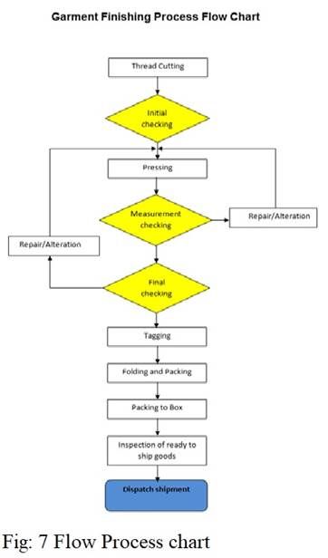
Process mapping is a tool used in Six Sigma to map out the steps of a process in order to identify potential areas for improvement. It involves creating a visual representation of a process in order to better understand how it works and identify any inefficiencies or problems. Process mapping can be used to identify areas where processes can be streamlined, reduce cycle times, or increase quality. It is a useful tool for understanding complex processes and can be used to inform decision-making.
An example of process mapping in the garment industry would be to map out the various steps in the production process, from the design of a garment to the shipment of the finished product. By mapping out the process, it can be easier to identify any potential inefficiencies or bottlenecks, such as long lead times or slow processes. It can also help identify areas where processes can be streamlined or automated, resulting in improved efficiency and quality.
Failure Mode and Effects Analysis (FMEA)
Failure mode and effects analysis (FMEA) is a quality control tool used to identify potential risks and take preventive measures to reduce their likelihood. It is done by creating a list of potential failures, analysing the effects of the failures, and creating a plan to mitigate the risks. FMEA can be used to identify potential problems before they occur, allowing businesses to take corrective action before negative outcomes occur. The goal is to reduce the number of defects and improve the quality of the product or service.
An example of how FMEA can be used in the garment industry is to identify potential risks associated with production. For example, the FMEA process could be used to identify risks such as a machine malfunctioning, low-quality fabric being used, or a lack of efficient workflow. Once identified, corrective measures can be taken to reduce the likelihood of these risks occurring. This could include implementing regular maintenance on machinery, ensuring only high-quality fabrics are used, and streamlining the workflow.
Conclusion
Quality control is an essential part of any successful garment industry. By utilising various quality control tools such as control charts, Pareto charts, cause and effect diagrams, check sheets, histograms, scatter plots, process mapping, and FMEA, companies can identify any potential issues with their production processes and take corrective action to reduce defects and improve the quality of their garments. By utilising these tools, garment manufacturers can ensure that their products are of the highest quality and that their customers are satisfied.


Comments