The Newmorrow trend theme reflects a sort of yin-yang mood among consumers. On the one hand, they believe the ‘system’ is rotten, unable to change economic and social conditions that have become intolerable. On the other hand, there is also a conviction that change is still possible. This colour palette includes a brownish green called Primordial Soup. It prompts references to sewage and death, but it also reminds of the verdant, rich biological goop that spawned life as we know it, says the company.
Dissatisfaction with conventional ways of living stands behind the LongitudeLatitudeAttitude trend. Its colours are Bohemian. They range from a purplish fuchsia, called Nomadness, a warm, almost-orange yellow named Kaleido tribe, and grey blue called Cirrus aviaticus after the contrails of jet planes against the otherwise cloudless sky.
The trend theme named Through the Mirror attempts to capture a sense of ennui, of being adrift in a modern world while, at the same time, knowing that a spiritual reawakening is possible. The yoga practice of trataka inspires the pearl orange colour in this palette.
The Nerdylicious trend theme sees brainiacs finding acceptance as innovators in a complex world, with continuous curiosity and a passion for exploring new ideas and complex puzzles. Although the colours of Nerdylicious are soft and subdued, they are the brightest and most optimistic in the 2018 palette.
All the colours are toned down and a little bit grey. At the same time, however, there is a sense of resolve, a determination to endure and a cautious optimism that people can make a difference and things will get better over time, so many of the colours are also warm, organic and hopeful.
An international team of specialists from the Clariant ColorWorks design & technology centres look at the state of global societal attitudes and forecasts colours that can be expected to connect with consumers on an emotional level in the next few years.
“For the first time, we are able to show people exactly what some of the 2018 colours look like in finished form. Fabric and carpet designers always use a combination of colours and so these samples provide a bridge between the colour world and the fibres world,” said Alessandro Pozzati, Clariant ColorWorks industrial designer.
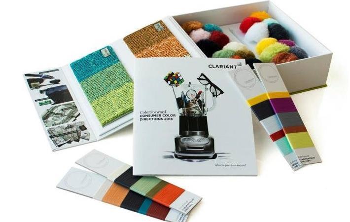
The ColorForward presentation kit includes 20 trend colours presented in the form of pompons made of polypropylene and polyamide fibres, ‘wrap cards’ with polyester fibre samples and carpet samples developed in partnership with Performance Yarn business of Radici Group. (KD)
Fibre2Fashion News Desk – India